When working on training any deep learning model whether it is a custom architecture or pre-trained network, it is key to obtain a detailed evaluation of the model’s performance. In scenarios, where model’s performance is below one’s expectations, I believe, it is important to understand the underlying reason to achieve significant improvements. From my personal experience, there is always a reason for any behavior of the model, if one digs deep enough.
When it comes to object detection and instance segmentation models, industry standard is often times COCO mAP/mAR scores. While they are good for summarizing and comparing architectures’ performances at a global scale, they lack in providing detailed understanding of specific model’s performance and providing deeper insight into error types, how well predictions and gt masks overlap, which particular objects are the hardest to detect, etc. Also, as I was digging deeper into source codes for COCO evaluation, I found few mistakes in the implementation and finally made my mind to design and develop my own custom metrics described below in detail.
The custom evaluation metrics are automatically logged into a web platform with various tables, graphs directly visualized as part of a detailed evaluation report. An example of such a report is provided below.
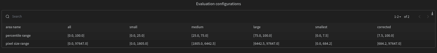
0. Evaluation Configurations
IoU type = “segm”
For the sake of brevity, all metrics are based on segmentation masks, though evaluation based on bounding boxes is also supported.
IoU Thresholds = 0.50 to 0.95, step=0.05
To be consistent with standard metrics like COCO, majority of metrics are evaluated at multiple IoU thresholds specified above.
Recall thresholds = 0.0 to 1.0, step=0.01
Metrics like COCO are based on multiple recall thresholds, they are also used for plotting Precision-Recall curves with linear interpolation at above recall thresholds.
Classification score threshold = 0.80
Only predictions with classification confidence above this threshold are kept and the rest are ignored. Ideally, COCO Metrics and Precision-Recall curves should be evaluated before applying this threshold (this will result in higher mAP values). Since models were already containerized this isn’t possible at the moment.
Classes = “box”
There is only a single class for this example, but evaluation can be extended to multiple classes with metrics for each class. Also, class agnostic metrics can also be provided.
Area types = “all”, “small”, “medium”, “large”, “smallest”, “corrected”
Metrics are also provided at multiple mask sizes specified above. Size ranges are based on percentile values of the overall distribution of GT mask areas. Table below provides those percentile ranges and actual pixel size ranges.
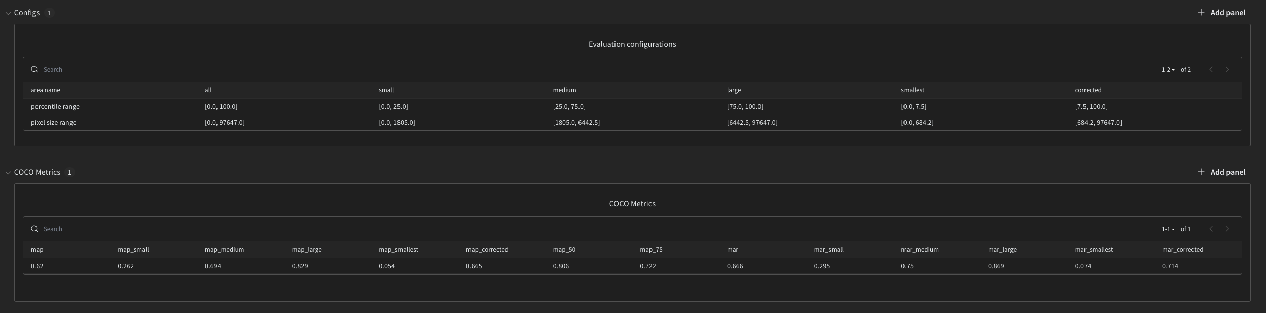
1. COCO Metrics
To be consistent with standard COCO Metrics, mean average precision mAP and mean average recall mAR at different area types and IoU thresholds are provided below.
In COCO definition:
- mAP – precision averaged across all classes, recall thresholds and IoU thresholds
- mAP_50, mAP_75 – precision values at IoU=50 or 75 averaged across all classes and recall thresholds
- mAP_small, mAP_medium, mAP_large, mAP_smallest, mAP_corrected – precision values averaged across all classes, recall thresholds, IoU values for objects that fall into range small, medium, large, smallest, corrected, respectively.
- mAR – recall averaged across all classes and IoU thresholds
- mAR_small, mAR_medium, mAR_large, mAR_smallest, mAR_corrected – recall averaged across all classes and IoU thresholds for objects that fall into specific area ranges, respectively
Both mAP and mAR have values between [0,1], the higher the better.
While mAP and mAR are nice ways to summarize the overall method with just two numbers, for a deployed model we are more interested in a single recall threshold, not all of them (more on this in the next section).
2. Precision-Recall Curves
There is an alternative definition of mAP that is defined as an area under the Precision-Recall curve. It is easier to understand visually and also provides a way to choose a classification confidence threshold.
Precision-Recall curve – is a plot of precision and corresponding recall values at different classification confidence thresholds.
- Every prediction has an associated confidence score. When the model is deployed, specific classification confidence threshold is used (0.8 in this case), such that only predictions with confidence above the threshold are kept and the rest are ignored. Hereby, Precision-Recall curve provides a nice way to choose this threshold (a single point on the curve) as a trade-off between precision (tendency to make FPs) and recall (tendency to make FNs) values.
- Area under the Precision-Recall curve evaluates the method as a whole. As the method converges to the unit square, the better it becomes.
Graphs below illustrate Precision-Recall curves and their corresponding classification confidence scores at various IoU thresholds and mask areas. All curves were interpolated at recall thresholds from the configurations above for ease of visualization in wandb.
Interesting to notice:
- Performance of the model on small and smallest objects (smallest 25th or 7.5th percentile of objects) is worse compared to other area categories. Specifically, the issue seems to be with recall and FNs – missing detections.
3. Aggregate Metrics
Table below shows actual number of GT, DT, TP, FP, FN, Precision and Recall at various IoU thresholds and mask areas.
4. Image Metrics
While aggregate metrics are helpful, we may be also interested in per image level metrics.
Graphs below nicely illustrate detections as a sum of TPs and FPs. Similarly, for GT as a sum of TPs and FNs at a per image level.
Interesting to notice:
- Model does have some false positives. But false negatives, seem to be a bigger issue
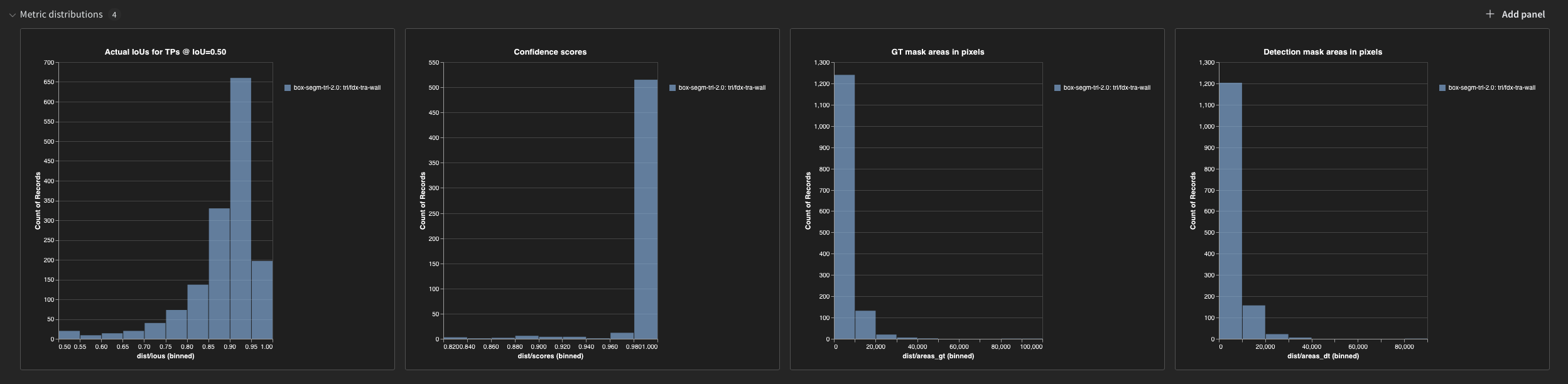
5. Distribution Metrics
While evaluating the model at various IoU thresholds is an industry standard, they may be overwhelming.
Instead let’s use IoU threshold=0.5 and look at actual IoU values for TPs. Graph 1 below does exactly this.
Other graphs below, also provide some useful information about the distribution of classification confidence scores, GT and DT mask areas.
Interesting to notice:
- From graph 1, majority of detections have a relatively high IoUs > 0.85.
- From graph 2, classification confidence scores are mostly very high. In other words, model is always confident, even when it makes a mistake.
6. Visualizations of TPs, FPs, and FNs
While graphs and metrics above provide useful aggregate information, looking at actual errors is what provides the actual understanding of the errors and reasons behind them.
Table (not shown here) provides overlayed masks for each of TPs, FPs, FNs with some additional information, such as IoU scores, class scores, etc.
Images can be sorted by each column. So we can specifically look at images that have the greatest number of GT, FP, FN, high precision and recall scores.
